Input Fields
Input fields are field types where input from the user is expected. This could be text or numbers, but can also include attachment of documents, ratings, electronic signatures etc. Entry of data can be made mandatory or optional and validated either using regular expressions or the advanced properties as described in Advanced Properties.
The following field types are available within the 'Input' section of the left hand menu bar.
Text Fields
Text fields are fields where the user can enter free-format general text. They can be used for descriptions, references etc. and contain letters, numbers and most punctuation characters.
Text Area
This type of field is similar to a text field but the text can spread over multiple lines - when entering information simply use the enter key to start a new line.
Number
This type of field only allows the entry of numeric data. As well as the usual validation options, you can specify a fixed number of decimal places and a format. Use a number field if you wish to perform calculations on the value entered later in the form.
Date
This allows the entry of a date, either by selecting from the pop-up calendar or by entering the value directly into the box.
Date & Time
Allow entry of both a date and time.
Time
Allows entry of just the time. Values can be defaulted, so for something like a timesheet if usual hours are 9:00 to 17:00 these could be set as defaults which the user can override during data entry if different hours were worked.
Image
This allows the attachment of an image to the transaction. This could be a scanned image of an invoice, receipt etc. and is viewable during the process by those approving the transaction, and when the transaction has been completed. It is also available for download for anyone able to view it.
Document
Similar to the image type, this allows the attachment of documents including Excel spreadsheets and Word files.
Multiple Upload
This allows the upload of more than one file within the same attachment field. A wide variety of file type are supported including images, documents, CSV and Zip files.
Signature
This provides an area for the user to electronically sign a transaction to indicate receipt of goods etc. Can be operated via a touchscreen, touchpen or mouse.
Email
Similar to a text field, but ensures that the data entered is in a valid email format. Most browsers will offer an auto-complete list for recently entered emails when users click into this field.
Slider
This type of control displays a horizontal bar which the user can drag a control along.

Parameters for this control include a minimum, maximum and default value and so it can be used to capture percentages, marks out of 10 etc. in a user-friendly way.
Toggle
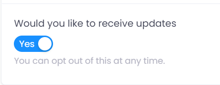
This presents the user with a Yes/No option. You can specify which of these it defaults to in a new transaction.

The visibility of other fields can be made dependent on this. For example, if the user wants to receive updates then setting this to 'Yes' could make an additional section visible where they can enter their contact details.
Rating
Similar to a slider, but this allows the user to enter a rating from zero to five stars in half star increments.
Checklist
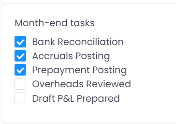
This presents the user with a list of items which they can tick.

It could be used for recording where a user or users are in a particular process, or where a user needs to pick one or more items from a selection. Items can be listed in a single column as above, or across the page in one or more rows.
Button
A button allows the user to interact with other applications to send and receive data from an external source via an API. Buttons work in conjunction with a Data Connector. The data connector determines where the data is coming from and contains any security or other information needed to interact with that system. The button then controls how that data is shown to the user, either rendering it to a field in the app, or displaying via a pop-up.
Pull Data
This field allows you to populate a table with data 'pulled' from another app or reference data table. This could be used to populate a purchase invoice automatically with details from the purchase order it is based on, or to get a list of stock items from a list held in reference data. Select the reference data or app you want to use as the source, and the table on your app you want the data pulled in to. The table you are using to receive the data should have field ID's matching the source information for all the fields you want auto populated when the button is clicked. Pull data also has filters on the 'Advanced Properties' tab to allow you to narrow down the data returned, for example to only retrieve data related to a specific purchase order selected by the user.
When selecting a table from within an app to use as the source, these are listed separately to the main app. So if you have an app called 'Purchase Order' and a table within it called 'Line Details' then to pull data from this table select 'Purchase Order - Line Details' as the data to use.
Password
This is similar to a text field, but hides the data being entered.
Data entered can be temporarily made visible by click the 'eye' icon to the right of the box. This would often be used when access data from other systems where an individual users log-in details are required.
Get External Data
This works in a similar way to a button but allows for the data being extracted to be returned within the same field and used by calculations in other fields. As with the button this also works in conjunction with a Data Connector.